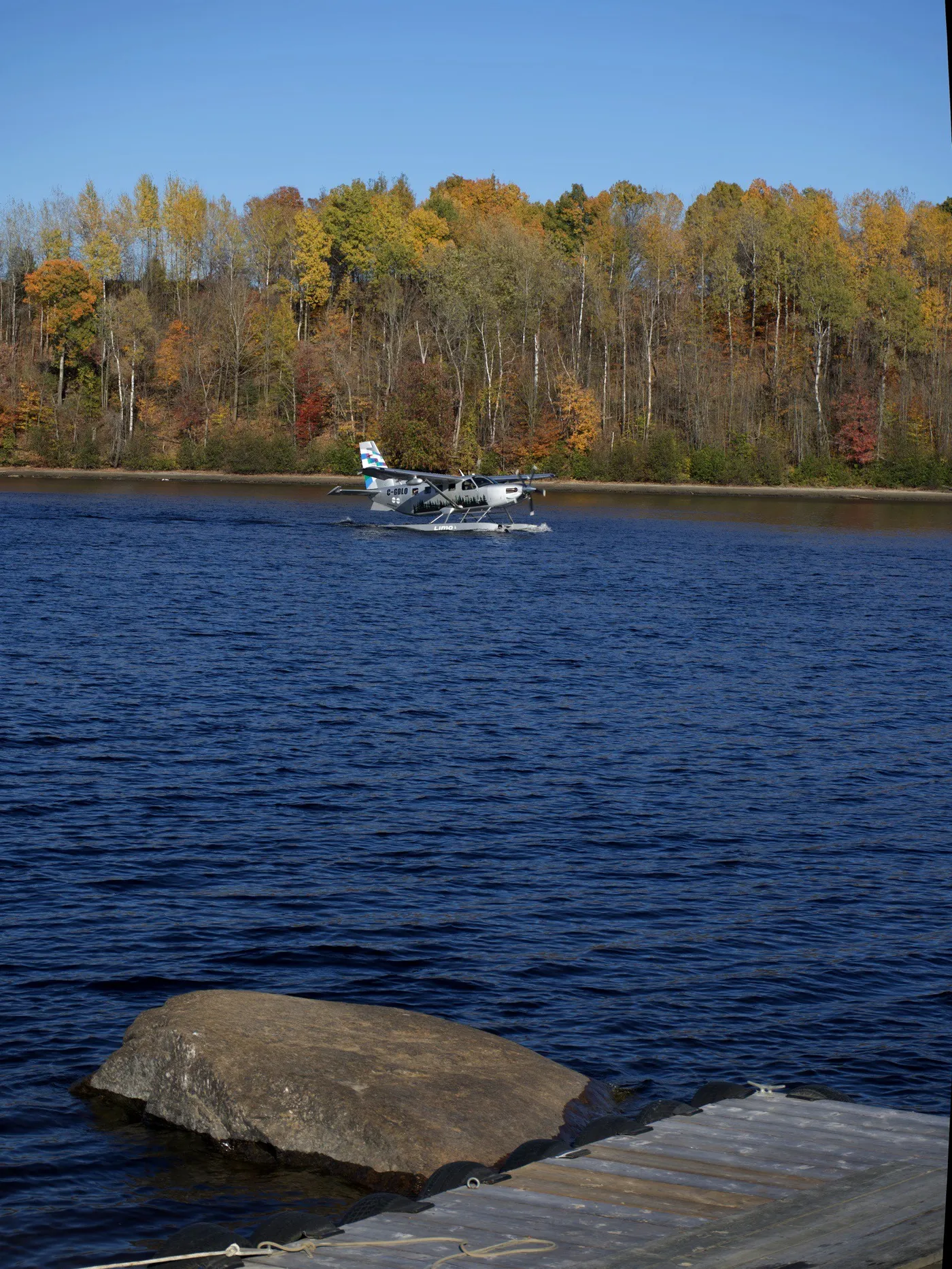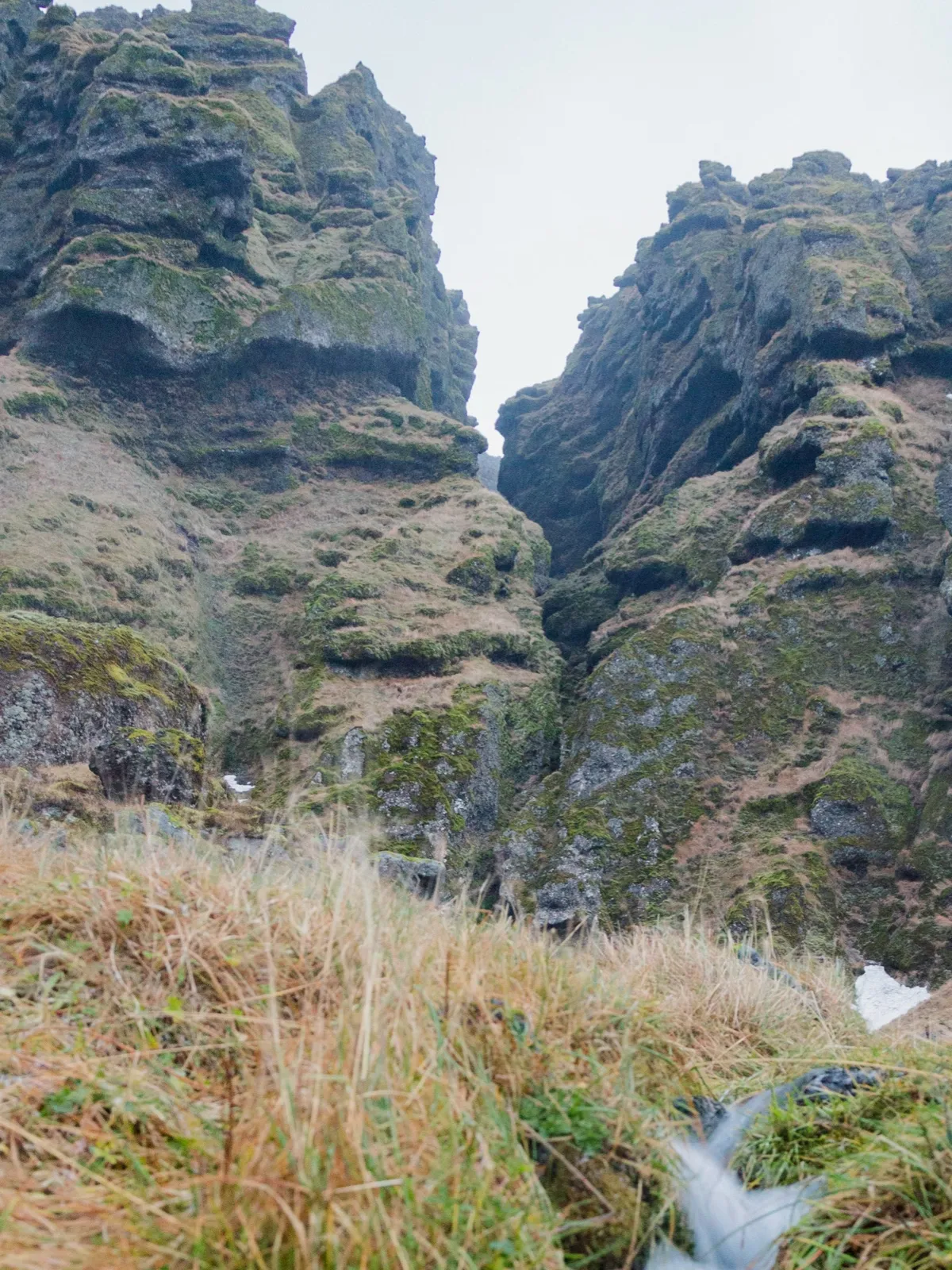
Negative space is the quieter area around the subject of a photograph. It could be water, sky, a plain wall or a tabletop. “Quiet” matters more than “empty”: the area can contain texture and still leave the subject easy to notice.
A wider frame can show isolation, direction or scale. It can also leave too much unrelated background. The task is to find space that contributes to the photograph.
See what the water gives the leaf
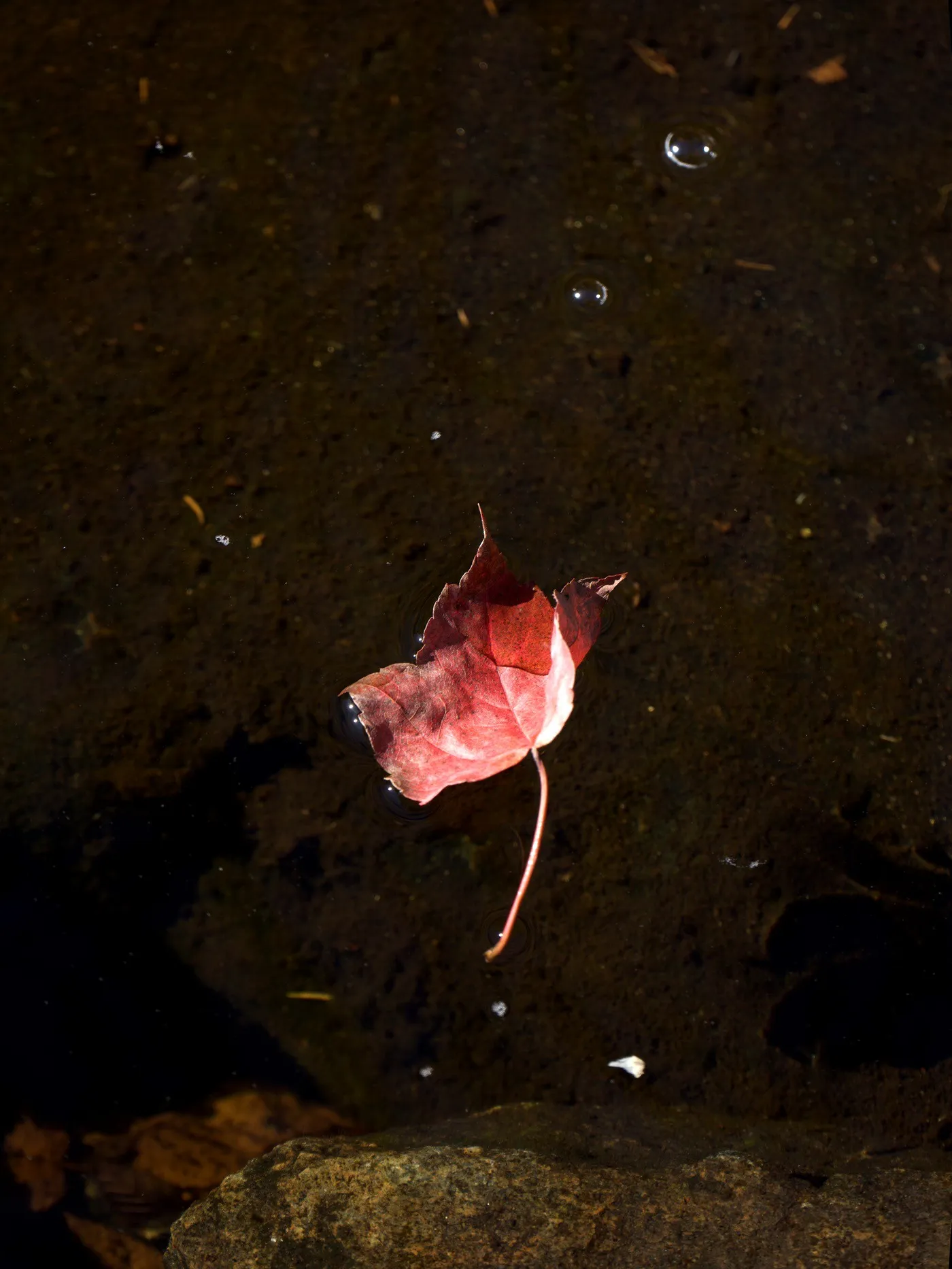
The red leaf above stands out against dark water. Its colour and curled surface catch your eye. The water is not a blank background: you can see submerged texture, tiny bright bubbles and the shadow beside the leaf.
There is enough separation for the outline and long stem to remain clear. If you cropped very tightly around the red shape, you would gain detail but lose part of the sense that it is floating.
The space is not completely quiet, either. A bright speck below the leaf and the stone along the bottom edge ask for some attention. They give you a concrete editing question: does keeping them help describe the shallow water, or does removing them make the leaf easier to see?
That is more useful than deciding that every photograph needs a certain percentage of empty space.
Find a quieter background before moving closer
When a subject is hard to see, filling more of the frame is one option. Another is to change what appears behind it.
For a cup on a table, shift sideways until a plain part of the wall sits behind the handle. For a flower, try a viewpoint that replaces a bright patch of sky with darker foliage. For a person, leave a little room between their outline and the shapes behind them.
The subject can remain the same size while becoming easier to notice. That is why background choice is part of composition, rather than a problem you always have to fix by cropping later.
Compare a wide frame with a tight one
Choose one object and make three photographs. Keep the light and your viewpoint as consistent as you can.
- Show the setting. Leave enough room to understand where the object is.
- Remove one distraction. Adjust the edge of the frame to exclude a bright or unrelated detail. Keep some surrounding space.
- Fill the frame. Make a much tighter version that concentrates on shape or texture.
Look at the photographs as small thumbnails. Does the object remain recognisable in the wider view? Does the tighter version reveal something worth seeing? Which one describes what interested you in the first place?
For the leaf, a tight frame could be about colour and texture. A wider one could be about a small bright object in dark water. Both are reasonable photographs. They make different choices.
Leave room where something is going
Space can suggest direction. A person looking right may feel more comfortable with room on that side. A bicycle pointing toward the edge can look cramped if the frame ends immediately in front of its wheel.
This is closely related to placing a subject near a third. Moving the subject off centre creates room, but the room still needs a job.
You can deliberately make the frame feel cramped or unsettled, too. If that is what you want to convey, try it and compare. Composition advice gives you options; it does not remove your ability to choose the less comfortable one.
When less space is the better choice
If the background contains several bright objects, leaving more of it may make the photograph harder to read. If a product’s small detail matters, a generous surrounding area may make that detail disappear on a phone screen.
A portrait may need enough closeness to show an expression. A food photograph may need the texture of the dish more than the rest of the table.
Use the wider frame when the space earns its place. Use the tighter one when detail is the point. BULB’s composition tools are built around helping you consider the frame before the shutter. You can make the same comparison with the camera you already have, one photograph at a time.